This is a digital illustration I did some time ago for a print ad by Button creative agency.
It was not the first time I did great work with these guys. It is, however,
a perfect example of how a simple and solid concept may evolve through smart art direction and great illustration.
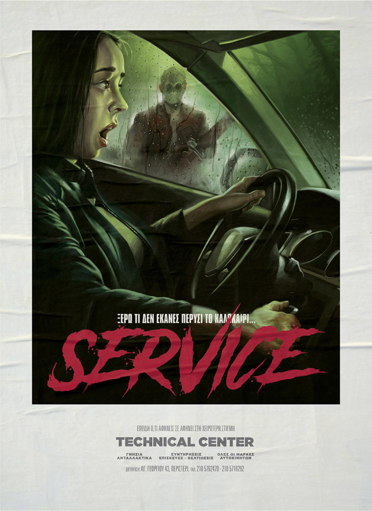
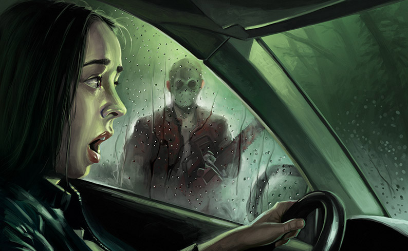
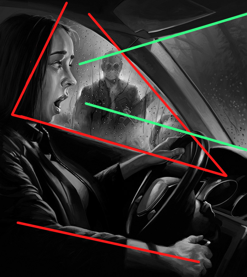
The concept was a dreadful situation when a car won’t start- though it definitely should! We had to have 3 focal points: the driver’s hand on the starter, her expression and the killer. Focusing on 3 points is extremely difficult to tackle. To pull it through, I decided to put the killer at the driver’s eye level and make this the focal point. The hand on the starter would play a supporting role.
I believed it would best serve the concept to make a horror movie poster out of it, both in typography and illustration. Big strokes, monochromatic palette, high contrasts and scene cutting axes that increase the tension.
The lighting should be both realistic and eerie.
Since I thought this was the way to go, I pitched the idea of a horror movie poster to the Art Director and Creative Director, Christina and Costas. They both liked it, we went through some details together and that was it!
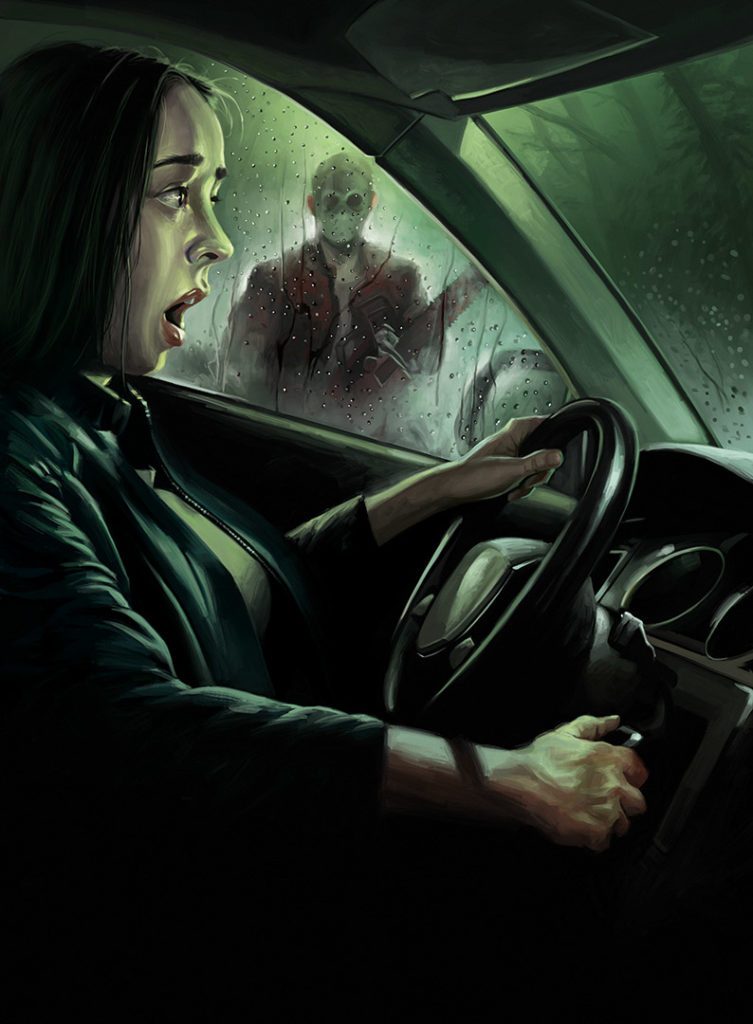
Christina and Costas worked on the typography and layout, I worked on the illustration. When we were all done, I put all the elements on a paper texture that looked like a movie poster on a wall… et voila!