Αt last I can share with you a poster I drew during this summer, for a new greek Sci-fi TV series called “Commandos and dragons” (“Κομάντα και Δράκοι” in greek), for Mega TV Channel.
The Art Director of the Ad agency, Jannis, called me to talk about the project. He asked me to draw a poster for a new modern Tv Sci-fi series, like the 80s movie posters.
I had to avoid doing something too fancy or scary. It’s the first time the Greek audience would watch a Greek Sci-fi production and the agency didn’t want to give the impression of a horror or terror series.
The deadline was tight, almost 3 weeks. During that time I was working on several other projects and doing revisions on another tv series poster. I also had to deliver everything by the end of July, just before the summer vacation.
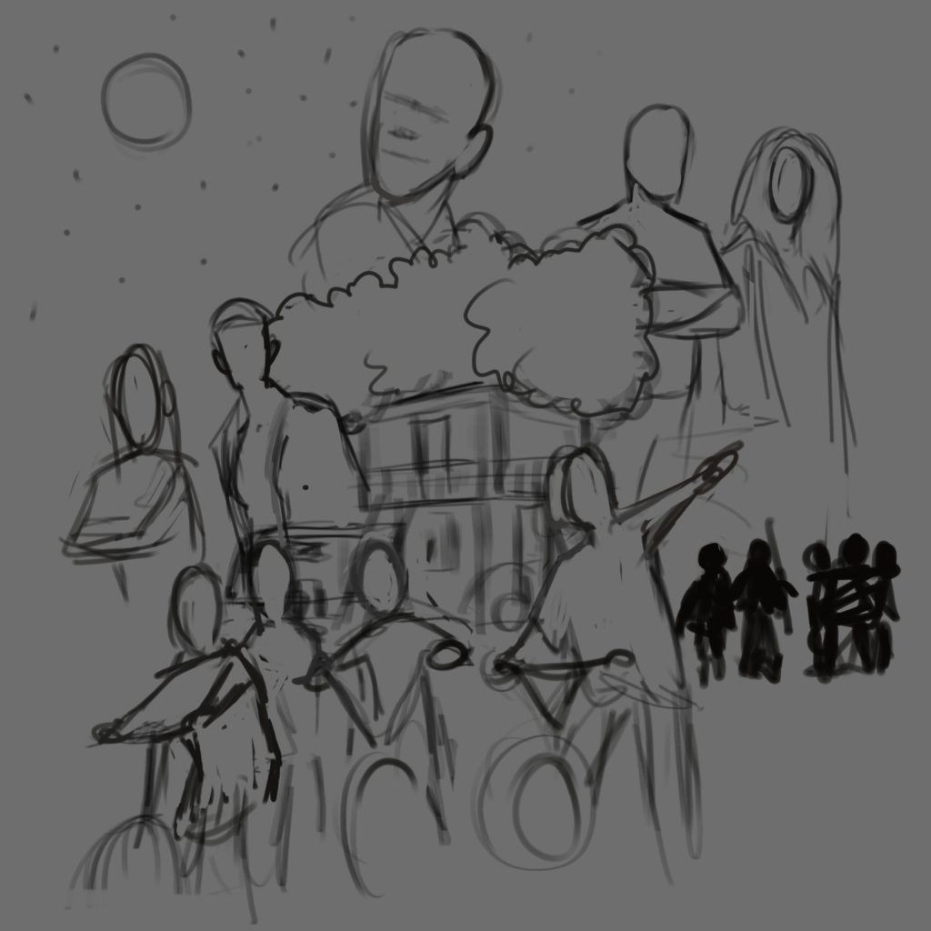
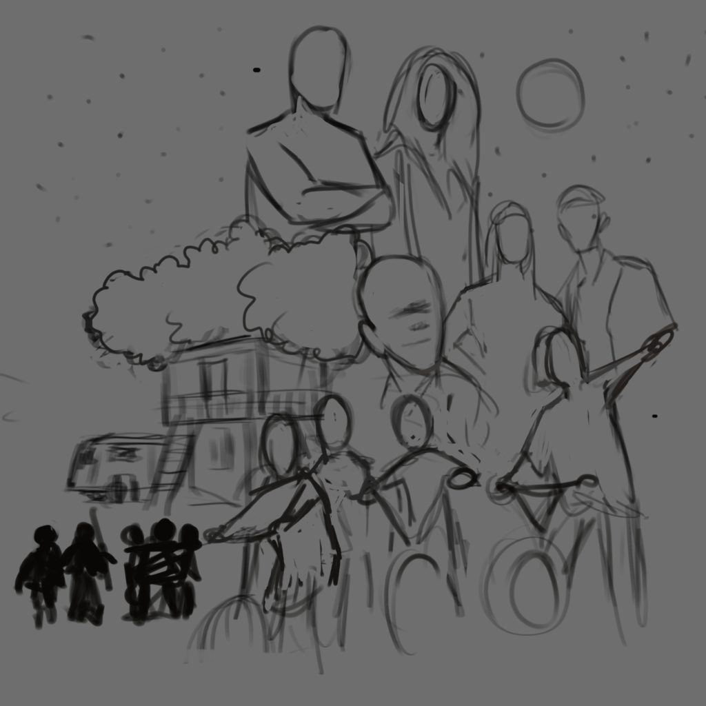
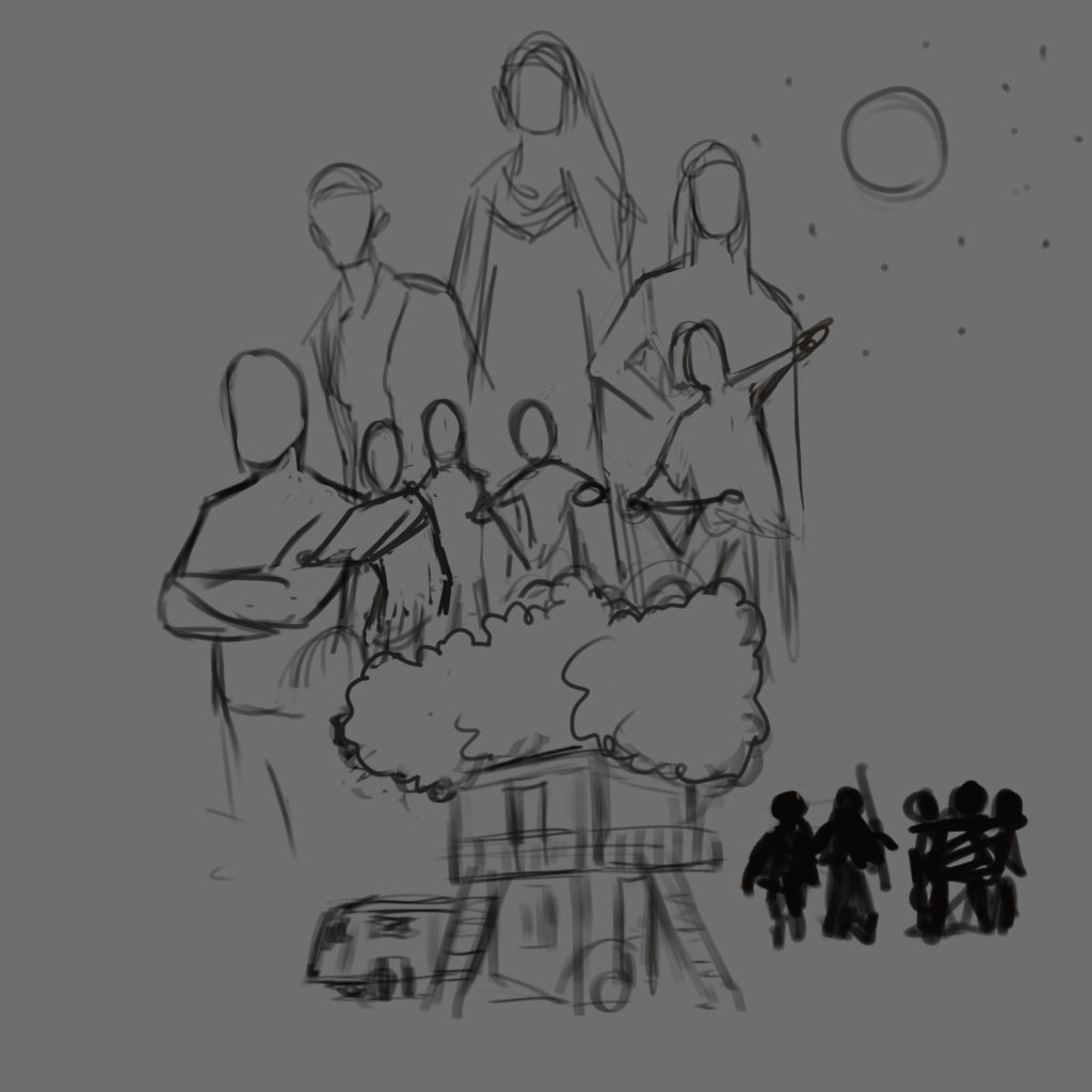
The Drafts
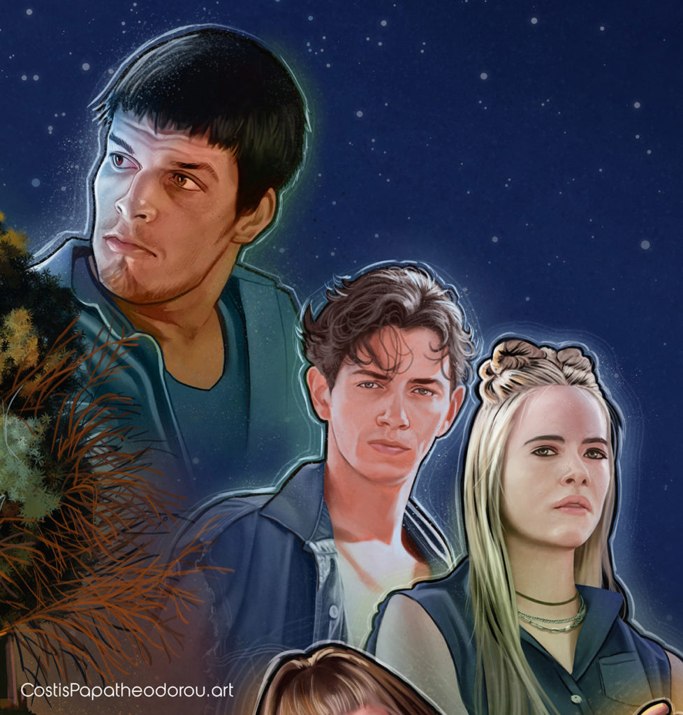
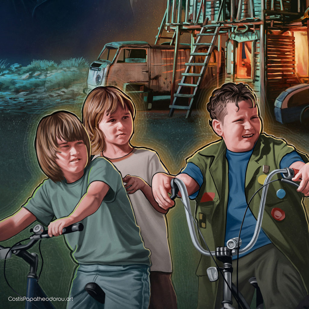
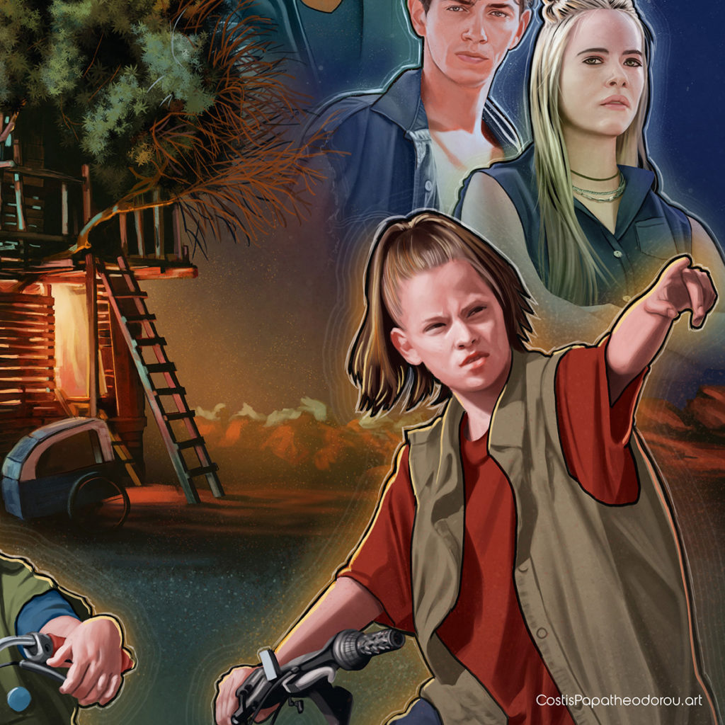
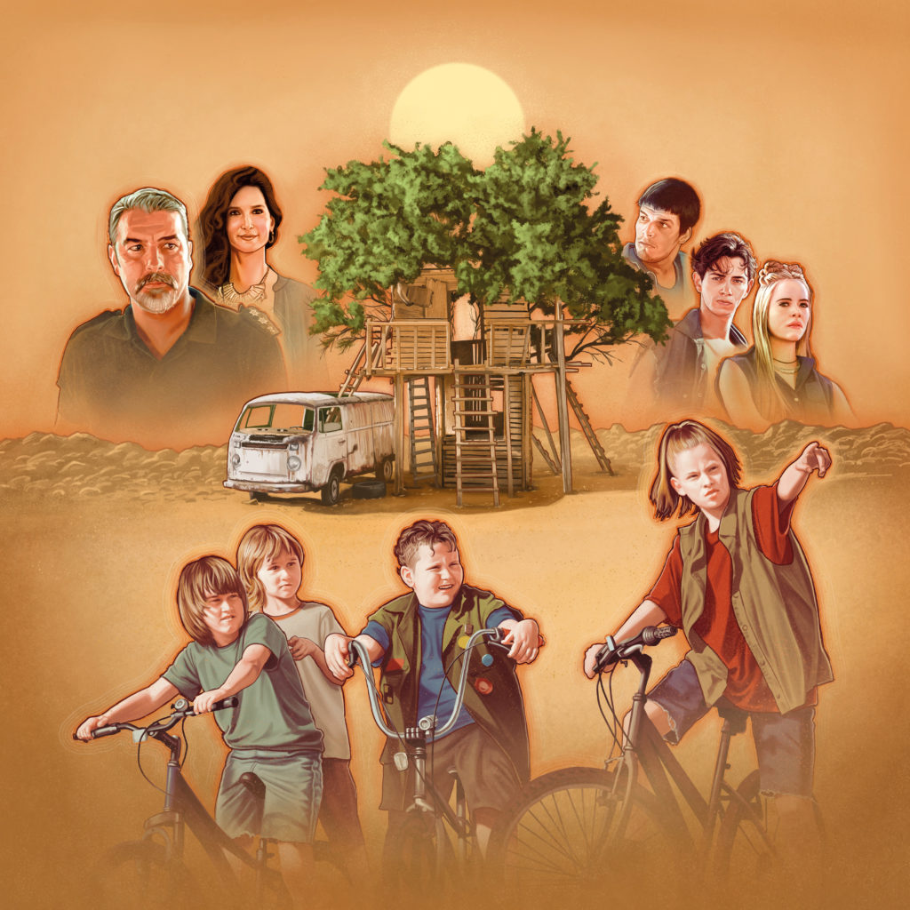
I knew that I should draw an ensemble cast. So I had to group the actors based on the plot; the children on their bikes, the teenager couple, and the adult couple. Also, there was Dodo a young guy, an important character that had to be seen.
The first thing I had to draw was some draft thumbnails, based on the production photographs I was given, to find the right composition.
Drawing process
In the first poster version, I painted a moon. A strong light source would help the composition and would define my color palette. Unfortunately, after a couple revisions, the moon idea was killed. It probably was too romantic. Nevertheless I liked the idea of an off frame blue light source.
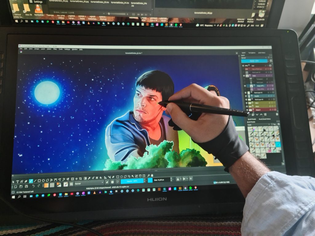
As I mentioned earlier I had to draw using production photo references. It wasn’t easy as I had to change the actors’ faces lighting. Some of the photos were not clear enough to understand the face anatomy of the actor’s face. So many things had to be invented. And that was tough.
After a few days, I ended up with the first composition, which I send to the Art Director and the client, as a Work In Progress. There were many things to keep working on, like the lights and the floor of the background.
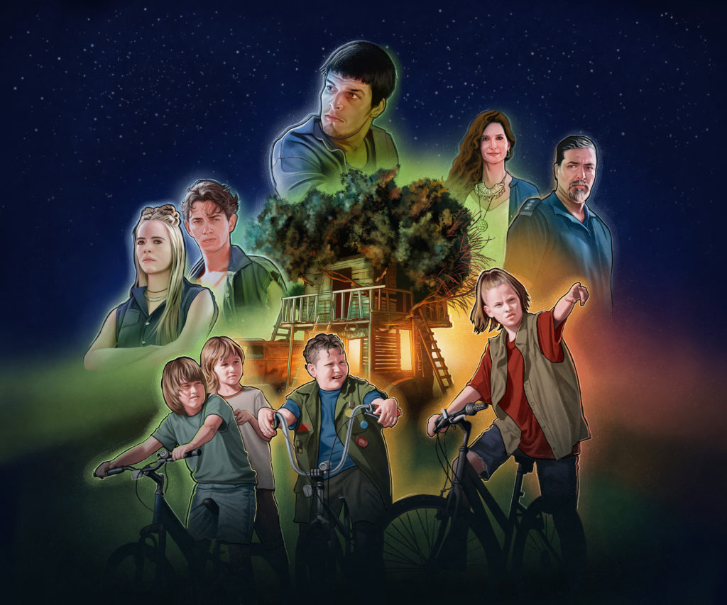
I couldn’t resist the idea of bright lights with vivid colors. I love this kind of color variety. The one part of the image has reds, oranges, and yellows mixing with the dominant blue on the background. The other part has cyan and green. So there is a colorful contrast between the warm and the cold hues.
The final design
The client disliked all the vivid colors. Ouch! Wanted something more realistic in terms of light and color.
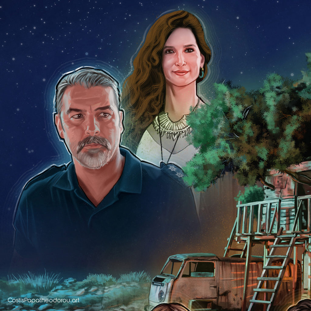
There were also a lot of revisions. For example, I had to redraw the policeman at the left. The composition kept changing as well until we got the client’s final approval.
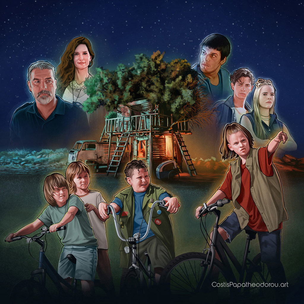
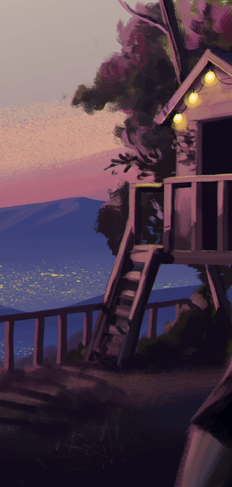
Below you can see some details of the final poster.
Back to Drawing Board
Many days after I delivered the poster, the Art Director called me again and said that the client had some doubts. Not sure if this was the right approach for the poster. So he asked me to draw a second poster.
It was almost two weeks before the summer vacation and I had some other projects due as well. So I could spend a couple of days reworking it -no time to draw everything from scratch.
The Art Director and I decided that the only different approach would be to use the same composition with some alterations. I took the chance to draw a more Drew Struzanesque version!
This time the color palette was based on warm hues: orange, yellows, and reds, to create a warm “adventurous” summer feeling.
At that time I was very tired emotionally. Having to work again on the same poster, after 2 weeks of hard work, felt awful. I was feeling burnt out.
I decided I wouldn’t loose more time than necessary on the portraits, to focus on painting a new Tree house and the background. So I made some color corrections on the portraits and redrew here and there, only where I felt I had to Voila!
Thank God we use computers nowadays – imagine drawing from scratch all the revisions! And still, having to work with many layers was very annoying, because of the illustration size (60x60cm, 23,6×23,6 inches at 300 dpi).
And guess what… the client decided in the end to use the first poster.
These two posters were drawn in Krita using my favourite Huion Kamvas 22.